The Domino Effect of School Closures: A Geospatial Look at Service Network Decisions
The ongoing debate about municipal service networks—be it healthcare, libraries, or education—often boils down to a conflict between cost efficiency and local accessibility. When a municipality faces budget constraints or population shifts, the removal of a local school from the service map is a tough decision with deep community roots.
I wanted to shed light on the real-world impact of such choices. So, I ran a simulation using Finnish population and school data. In this article, I step into the shoes of a municipal board tasked with a difficult choice: to identify which two schools to remove from their service network and analyze the human cost of that decision for the children affected.
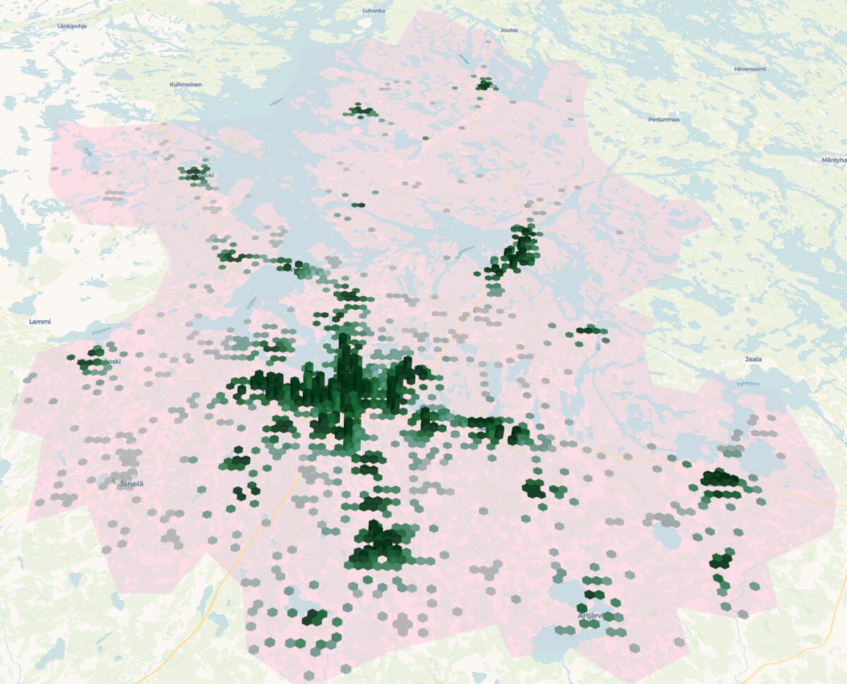 Children (0-14 years old) population visualized over the are of interest. The higher and greener the hexagon the more the population (going from 0 to 444 children per hexagon).
Part 1: Mapping the Current Reality
My base data included:
- Aggregated Child Population: The number of 0–14-year-olds mapped onto 250 m×250 m grid cells. The center point (centroid) of each cell represented the population’s starting location. (Stats Finland, 2024)
- School Locations: The exact coordinates of all existing schools (primary school) in the region. (Stats Finland, 2024) To start, I employed the simplest accessibility metric: Euclidean distance, or the “bird’s-eye distance”. While none of the children flies to schools (I suppose!), this provides a vital, unbiased first layer of information.
For every population grid cell, I calculated two key distances:
- Distance to Nearest School (D1): This tells us the current status quo.
- Distance to Second-Nearest School (D2): This is the crucial piece of information for simulating a closure. If the nearest school (D1) is removed, D2 instantly becomes the new minimum distance for the children in that cell.
Part 2: Developing a Data-Driven Removal Strategy
While financial factors or building condition often dictate school closures, a responsible service network analysis must prioritize minimizing the disruption to children.
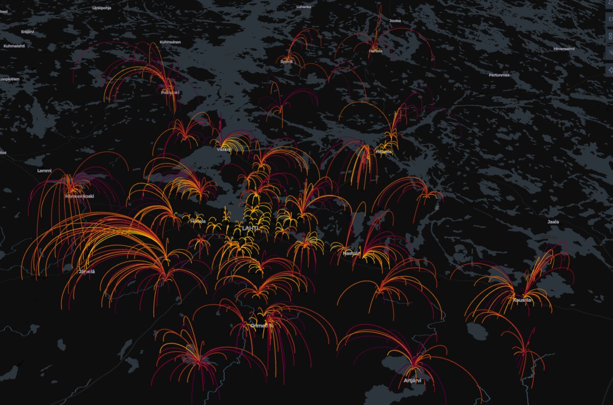 This visualization uses arcs (lines) to show the linkage between each population centroid (representing children aged 0–14) and its calculated nearest school in the service network. The color and intensity of an arc indicates the number of children (population density) being served by that particular connection. Brighter, more intense colors (e.g., yellow/orange) highlight areas where a larger number of children must travel to that specific school, often indicating a dense population center or a major school catchment area.
I developed a simplified internal “keep score” to determine the most logical schools for hypothetical removal. This score was based on two criteria, favoring schools whose removal would cause the least disruption:
- Low Local Enrollment: The school had to serve a minimal population, meaning it was the nearest school to a relatively small number of 0–14-year-olds.
- Minimal Displacement Impact: The students currently attending the school should live near a viable alternative. I prioritized removing schools where the average distance to the second-nearest school (D2) for its population was the shortest.
The schools that scored highest according to these criteria became my two hypothetical candidates for closure. These are the schools whose removal would statistically cause the least immediate disturbance to the service network, as their students already have a relatively close alternative.
Part 3: The Realities of Travel Time
After hypothetically removing the two lowest-ranked schools, I looked at the affected population.
My analysis showed that the average bird’s-eye distance for the entire regional child population didn’t increase dramatically. This is because the majority of children live close to schools regardless of which two were closed. However, the impact on the specific children affected was quite significant.
This is where the initial Euclidean distance analysis ends and a more complex one begins. For the children who lost their local school, and whose nearest option is now D2, I had to calculate the real travel impact using a road network analysis.
The results clearly highlighted the compromise: For the affected children (193 children representing 0,75 % of total children population), a convenient shorter journey was often replaced by a travel distance that was two to three times the original (average distance increase 11.7 km). This translates directly into a new daily commute that frequently necessitates a school taxi/bus, significantly impacting their quality of life and time spent in transit.
| Metric | Value | Context/Notes |
|---|---|---|
| Number of Population Grid Points Affected | 32 | 3.15% of all points |
| Number of Children Affected | 193 | 0.75% of total children |
| Average Distance Before Removal | 5.0 km | To current school |
| Average Distance After Removal | 16.7 km | To new nearest school |
| Average Distance Increase | 11.7 km | Doubling/tripling the journey |
While the overall distance average across the region remains low, the increase in distance for a particular group of children is a heavy cost that municipalities must weigh carefully.
Conclusion: Beyond the Closures
My hypothetical analysis proves that data is crucial for minimizing disruption, but it’s never the final word. The ultimate decision on a service network change must incorporate factors outside a purely geographic model.
Going forward, the analysis should also include:
- Budget Analysis: A detailed examination of the operational costs and potential savings for each school.
- Personnel and Zoning: The actual geographical availability of personnel and population forecasts for the coming years to ensure the remaining network is sustainable (while using also more precise demographic data with the “Grid Database” from Stats Finland.
- Alternative Solutions: Exploring methods like flexible transportation options or alternative education delivery to serve children who live far from the remaining school network, ensuring their quality of life is maintained.
The key takeaway is that every service network decision requires a balance. We need these simulations to quantify the impact on the individual lives of children so that efficiency measures can be implemented with maximum care and minimum compromise.