Post
Mapping Unemployment: Spatial Patterns and Clusters in Jakobstad with Finland's Fine-Grained Statistical Data
National or municipal unemployment figures are useful, but they flatten space. Once you look at unemployment on a 250-meter grid, the picture gets more interesting.
In this post I used a sample dataset from Jakobstad (Pietarsaari), based on 2017 data. The case itself is small, but the method scales well. The same approach can be applied much more broadly with Statistics Finland’s regularly updated grid dataset.
Jakobstad works well as a case area because it is small enough to inspect closely, but still large enough to show meaningful variation inside the city.
What the Grid Adds
Municipal and regional figures do not show variation within a city. The RTTK grid database provides data at 250-meter resolution, which makes those local differences visible.
The study area contains 394 grid cells. Of these, 160 had the values needed to calculate an unemployment rate. This missing-data pattern matters when interpreting the results, especially outside the more populated parts of the city.
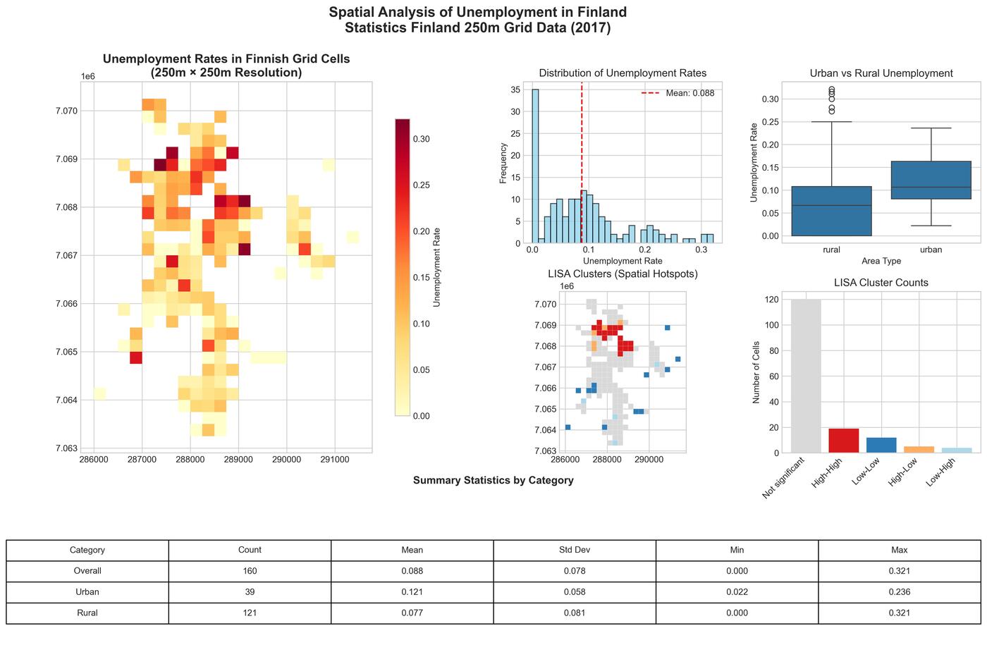 Figure 1: Overview of unemployment patterns across Finnish 250m grid cells, showing spatial distribution, LISA clusters, and key statistics
Urban and Rural Grid Cells
For this comparison, I classified cells with at least 1,500 inhabitants/km² as urban. In the available cells, the urban group had higher unemployment:
- Urban cells: 12.1% average unemployment (median 10.7%)
- Rural cells: 7.7% average unemployment (median 6.7%)
This is a descriptive comparison, not evidence that urban location causes unemployment. Statistics Finland suppresses values in cells where the population is too small for privacy reasons, so sparsely populated cells are not represented evenly. The threshold is also an analytical choice rather than a natural dividing line. Both points limit how far I would take the comparison.
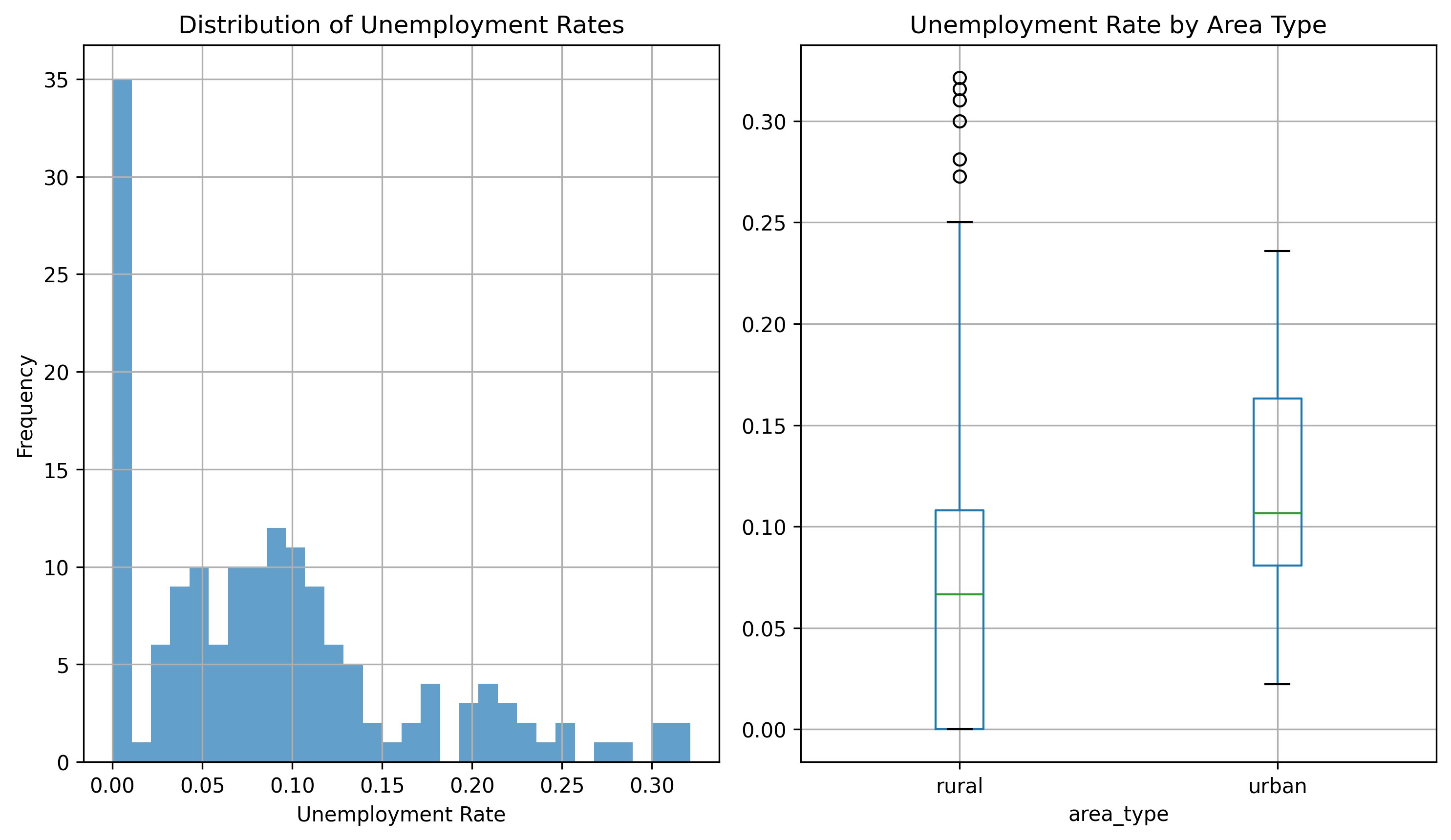 Figure 2: Distribution of unemployment rates showing the contrast between urban and rural areas
Unemployment Is Spatially Clustered
The second main result is that unemployment is not randomly distributed across the city. Moran’s I shows clear positive spatial autocorrelation:
- Moran’s I: 0.248 (p < 0.001)
- Interpretation: areas with similar unemployment rates cluster together
In plain terms, areas with similar unemployment levels tend to sit near each other.
Interactive Maps
The first map shows unemployment rates by grid cell. The second shows the local clusters identified using local indicators of spatial association (LISA). They are useful for inspecting individual cells, but the clusters should be treated as exploratory rather than as a list of policy priorities.
Unemployment Rate Map
Local Clusters Map
Hotspots, Coldspots, and Outliers
Local Indicators of Spatial Association (LISA) analysis identified distinct spatial clusters:
Hotspots (19 cells):
- Average unemployment: 20.1%
- Meaning: high unemployment surrounded by other high-unemployment cells
Coldspots (12 cells):
- Average unemployment: 1.7%
- Meaning: low unemployment surrounded by other low-unemployment cells
Outliers (9 cells):
- Mixed local patterns where a cell differs clearly from its neighbors
Workflow
I cleaned the RTTK grid data and calculated unemployment as unemployed divided by the sum of unemployed and employed people. I then:
- classified cells using the 1,500 inhabitants/km² threshold described above
- constructed eight-nearest-neighbor spatial weights
- calculated Moran’s I for the overall pattern
- used LISA to inspect local clusters and outliers
The spatial-weights choice ensures that every included cell has eight neighbors, including cells near the edge of the study area. It is still a modeling choice: a contiguity-based or distance-based definition could produce different local clusters.
The useful next step would be closer investigation of the areas behind the clusters, not automatic intervention based on the map. Repeating the analysis over several years would also be necessary before making claims about persistence.
Limits
This is still a small demonstrator, so there are obvious limitations:
- Temporal snapshot: the data describe 2017 and should not be read as a picture of current conditions.
- Missing data: only 160 of the 394 study-area cells had the values needed for the unemployment calculation.
- Privacy constraints: data suppression affects small-population cells and may affect the urban-rural comparison.
- Model choices: the urban threshold and spatial-weights definition affect the comparison and local clusters.
- Statistical interpretation: local cluster results are exploratory here; the analysis does not assess their policy significance or discuss adjustment for multiple local tests.
- Causation: spatial association does not establish why unemployment is higher in a cell.
If I continue this analysis, the next steps would be time-series comparison and combining unemployment with other socioeconomic indicators.
The main point is not that Jakobstad is unique. It is that the grid reveals local variation hidden by a municipal average. In this sample, unemployment is spatially clustered, but the missing cells, old data, and modeling choices all limit the conclusion. The maps provide a starting point for closer investigation, not a policy answer.
Data Source and Acknowledgments
This analysis uses Statistics Finland’s RTTK (Ruututietokanta) 250-meter statistical grid database. This sample dataset was downloaded from an online data portal managed by Esri Finland Oy.