Post
The Domino Effect of School Closures: A Geospatial Look at Service Network Decisions
Municipal service network decisions are rarely just technical. On paper, closing one school may look like a small efficiency measure. On the ground, it changes daily life for a specific group of children and families.
I wanted to look at that tradeoff in a concrete way, so I ran a simple simulation using Finnish population and school data. The question was straightforward: if a municipality had to remove two schools from the network, which ones would cause the least disruption, and what would that disruption actually look like?
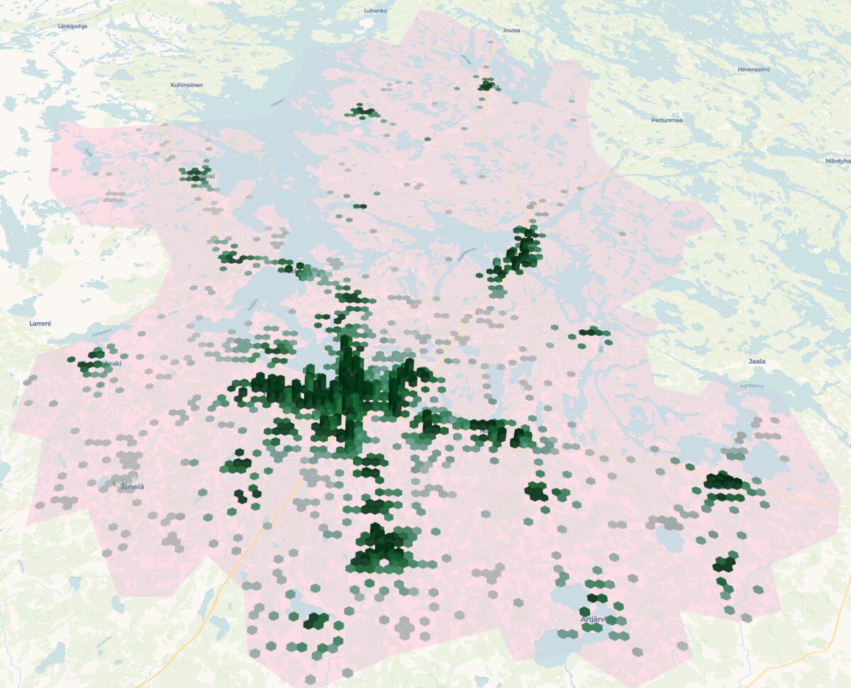 Children (0-14 years old) population visualized over the are of interest. The higher and greener the hexagon the more the population (going from 0 to 444 children per hexagon).
1. Starting From the Current Network
The base data was simple:
- child population aggregated to 250 m x 250 m grid cells, using the centroid of each cell as the starting point (Stats Finland, 2024)
- school locations for the study area (Stats Finland, 2024)
I started with the simplest possible accessibility measure: Euclidean distance. Children do not travel to school in a straight line, of course, but this is still a useful first pass. It tells us how the network is structured before we move to road-based travel distances.
For every population cell, I calculated two distances:
- distance to the nearest school
- distance to the second-nearest school
That second number matters more than it may seem. If the nearest school disappears, the second-nearest one becomes the new default immediately.
2. Choosing Which Schools to Remove
In real life, closures are influenced by budgets, building condition, staffing, politics, and population forecasts. This simulation ignores most of that and asks a narrower question: if the goal is to minimize disruption to children, which schools look most removable?
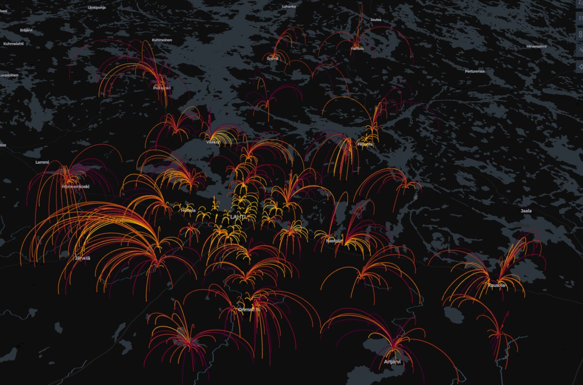 This visualization uses arcs (lines) to show the linkage between each population centroid (representing children aged 0–14) and its calculated nearest school in the service network. The color and intensity of an arc indicates the number of children (population density) being served by that particular connection. Brighter, more intense colors (e.g., yellow/orange) highlight areas where a larger number of children must travel to that specific school, often indicating a dense population center or a major school catchment area.
I used a simplified internal “keep score” based on two criteria:
- low local population served by the school
- short average distance to the next-best alternative
The two lowest-priority schools in that scoring became the hypothetical closure candidates. In other words, these were the schools whose removal seemed least damaging in the abstract model.
3. What Changed After the Removal
After removing those two schools from the model, I looked at who was affected.
At the full-region level, the averages barely moved. That is exactly the kind of result that can make a closure look harmless in a summary table.
But averages hide the real issue. The burden was concentrated on a small group of children whose nearest school disappeared.
For that group, I moved from straight-line distance to road-network distance to get something closer to the real travel impact.
The result was pretty clear. Only 193 children were affected, which is just 0.75% of the total child population in the study area. But for that group, the average trip length increased by 11.7 km. In practice, that often means a shift from a manageable local trip to a daily journey that likely requires organized transport.
| Metric | Value | Context/Notes |
|---|---|---|
| Number of Population Grid Points Affected | 32 | 3.15% of all points |
| Number of Children Affected | 193 | 0.75% of total children |
| Average Distance Before Removal | 5.0 km | To current school |
| Average Distance After Removal | 16.7 km | To new nearest school |
| Average Distance Increase | 11.7 km | Doubling/tripling the journey |
So the regional average stays low, but the local impact is heavy. That is the core point.
What This Kind of Analysis Is Good For
This kind of simulation is useful because it makes the tradeoff visible. It does not decide policy on its own, and it should not.
If I were pushing this further, I would combine it with:
- cost and savings estimates for each school
- staffing constraints and population forecasts
- more detailed demographic data from the Statistics Finland Grid Database
- possible mitigation options for the affected children
The main takeaway is simple: service network decisions always look cleaner in aggregate than they feel on the ground. GIS is useful here because it helps show who pays the price.