Post
Using GIS to Evaluate Bank Branch Coverage in Tijuana
Physical branch networks are expensive, and they are still important even as more banking moves online. That makes branch location a practical business question, not just a mapping exercise.
I put together this example using Tijuana to show how GIS can help structure that question better. The goal was not to build a perfect banking model. It was to see where branch coverage already works, where the network overlaps too much, and where higher-potential areas still sit outside convenient access.
The core ingredients were:
- branch locations
- 10-minute drive-time catchments
- census-based neighborhood data from INEGI
- a simple proxy for socioeconomic potential
That is enough to get past intuition and start asking more useful questions.
The Questions Behind The Analysis
For me, a branch network analysis usually comes down to three questions:
- Which locations overlap too much?
- Which areas with real demand are still underserved?
- Are we matching the network to the right type of local demand?
Method
The logic is simple. Take the existing network, add travel-time accessibility, and compare it against the local demographic structure.
Instead of working only with population counts, I built a rough socioeconomic indicator from census variables such as education and household assets. It is not a formal income measure, but it is good enough to compare relative market potential between areas.
On top of that, I generated 10-minute drive-time catchments for each branch and ATM. That gave me a way to separate areas into served and unserved zones.
Once those layers are together, the gaps become much easier to see.
Tijuana Example
In the Tijuana case, the analysis covered thousands of census blocks across the metropolitan area. The first useful output was simply a map of where current branches and ATMs actually provide convenient access and where they do not.
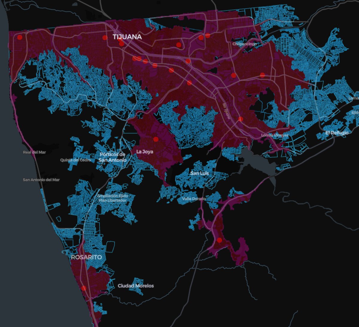 *Figure 1: Ten-minute driving-time isochrones around banking locations in Tijuana. *
When I compared those catchments against the socioeconomic proxy, a clearer pattern emerged: some higher-potential areas fell outside the convenient service zone altogether.
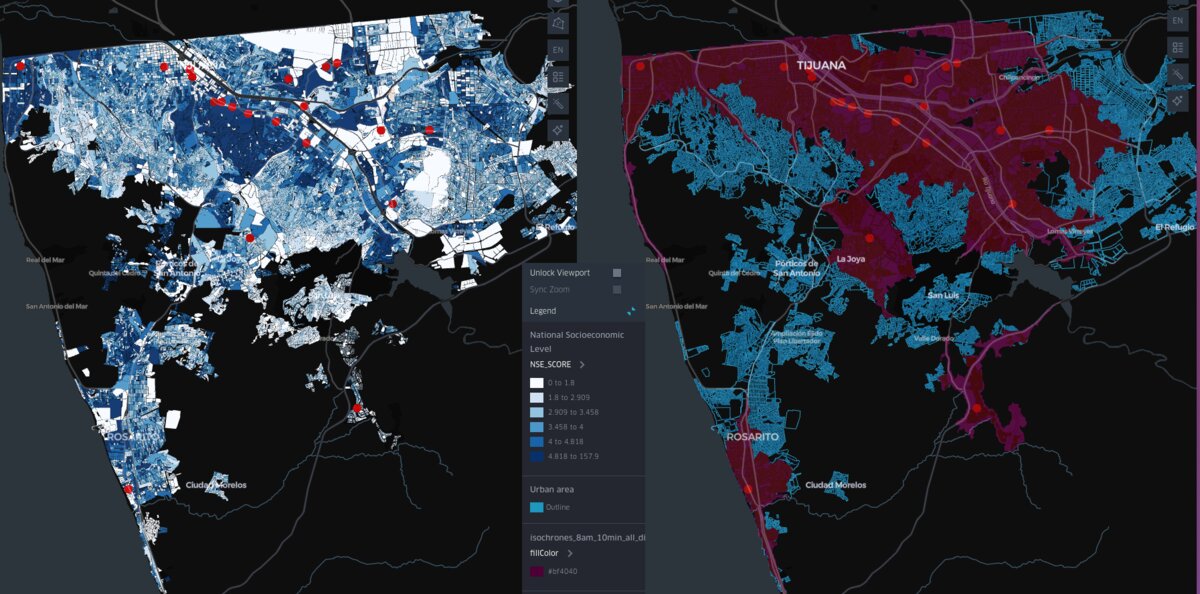 Demand vs. Coverage: Mapping Affluent Market Potential and Current Service Gaps. The left panel shows Socioeconomic Level (NSE Proxy) by census block (darker blue = higher affluence). The right panel overlays the 10-minute drive-time accessibility zones of existing branches. This visual comparison immediately highlights where high-value blue areas fall outside the established service zones.
I then aggregated the market-potential proxy into served and unserved segments.
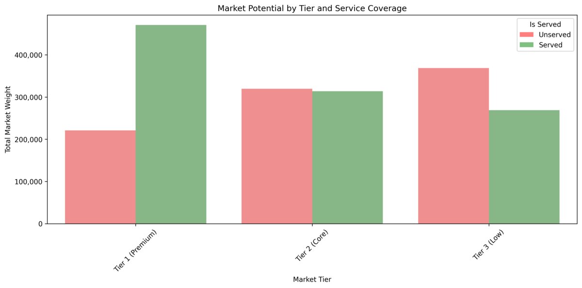 Market Weight Distribution: Served vs. Unserved by NSE Tier. Total affluence potential for each market tier, grouped by accessibility status. The chart identifies the 540,622 units of untapped market weight in the Premium and Core segments for high-priority expansion planning.
In this example, more than 540,000 units of high-value market weight in the Premium and Core segments sat outside the 10-minute coverage zone. The exact number matters less than the pattern: a meaningful share of attractive market potential was not being served conveniently.
Two things stood out:
- A large part of the core market was not covered conveniently.
- Even the more affluent segment still had meaningful uncovered pockets.
That does not automatically mean “open more branches”. It could also mean relocating, changing service format, or deciding that a digital-first model is enough in some places. But at least the discussion starts from evidence instead of guesswork.
Why GIS Helps Here
Banking networks are a good example of where GIS is useful because the business question is inherently geographic. Costs sit in physical locations. Demand is uneven. Accessibility is local. And the wrong intuition can be expensive.
Mexico is also a strong environment for this type of work because INEGI data is detailed enough to support much better spatial analysis than many organizations currently do.
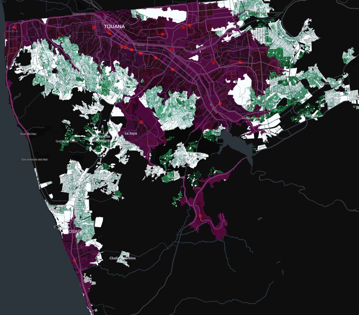 Expansion Priority Score (EPS): Pinpointing Underserved High-Value Markets. The green color gradient highlights the Expansion Priority Score (EPS), which quantifies untapped market potential. This score combines the socioeconomic quality of the block (NSE Proxy) with the density of affluent households, giving us a direct, ranked list of optimal locations for new branch investment.
Final Thought
The value of this type of analysis is not in making the map look impressive. It is in helping a bank decide where physical presence still matters, where it overlaps too much, and where genuine coverage gaps remain.
If you are working on a similar problem, contact me.